A Step-by-Step Guide
Now that public speaking has become my primary focus, I thought it was time I revamped my Speaking page. I thought I would document the process here, in the event that you are thinking about “going pro.” This is the first of two posts.
If you are an author—or want to be one—I highly recommend that you consider public speaking as part of building your platform. It is a great way to raise your visibility, promote your products, and develop credibility with your audience.
Before I began the actual re-tooling process, I studied the speaking pages of numerous professional speakers. I noted what I liked—and what I didn’t. I clipped my favorite pages to Evernote, so that I had easy access to them through the creative process.
Most importantly, I tried to evaluate these pages from the perspective of an event sponsor. This is my primary audience. Having been involved in planning hundreds of events through the years, I had a good idea of what is important to them as they are sourcing potential speakers.
I included the following components in my page. (You might want to open my new Speaking page in another window and refer to it as you read about the components below.)
- I decided on my “call to action” (CTA). In other words, what did I want the reader to do after reviewing my page? I used to invite them to “book me” (as in “call my booking agents and schedule me for your event”). But I now think that is too big of an ask.
Instead, following the lead of some other speakers, I now invite them to “check my availability.” It’s a safer first step. When they click on the button, they go to a separate page with a brief form. The button looks like this:

I also made the CTA button red to stand out from everything else on my blog and placed it in the upper-right-hand corner of the page, where I knew it wouldn’t be missed. (This is arguably the most important real estate on your page.) I also put a few other iterations of this button in the actual page text.
- I created a one-minute welcome video. Gail and I shot this in my study at home, My goal was to create empathy with the reader (i.e., the event sponsor) and provide a personalized preview of what was on the page. (The intro copy does essentially the same thing.)
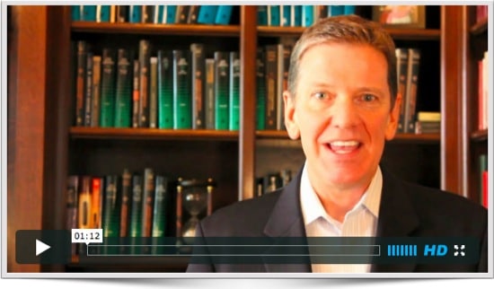
In case you are interested, I used a Canon 60D camera on a tripod. I did not use any special lighting. I also used an Audio-Technia ATR 3350 lavaliere microphone with a mono-to-stereo adapter from Radio Shack.
I also used an iPad 2 as a teleprompter, using the Proprompter HDi Pro2 from Bodelin Technologies. I decided to invest in this gear, since I have a number of instructional videos I plan to shoot in the future.
I edited the video in iMovie and then uploaded it to Vimeo, which I like much better than YouTube. It has many more options, including the ability to use a minimalist video player and custom thumbnail image.
- I provided an overview of the page. I arranged the sections in the order that made the most sense to me. I also solicited the advice of my booking agents, who made some excellent suggestions.
Regardless, I wanted the event sponsor to be able to navigate the page in whatever order made sense to them. Some may want to go first to the Most Requested Topics. Others may want to see the video clips first.
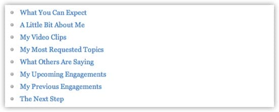
So, I created a list of the subheads and then hyperlinked them to the actual sections. That way they can navigate the page in whatever order they choose and always come back to this index by clicking on the “Return to Top” link at the bottom of each section.
- I explained what they could expect. When someone buys a product, they are not just purchasing an artifact. They are buying an experience. The same is true in booking a speaker. They are not merely purchasing a speech, but the entire experience around the speech.
This includes:
- The ways in which my booking agents interact with the sponsor, including the promptness of their replies.
- The first interaction with me via a pre-conference call.
- My promotion of the event (assuming they want that) via my blog and social media networks.
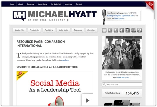
- A custom “Resource Page” for all the event attendees. It includes a copy of the slide deck I used in the presentation (embedded with SlideShare.net), along with links to books, blog posts, and other resources I believe will be helpful.
- A quick follow-up with the sponsor after the event to make sure I hit the target.
In Part 2 of this post, I will cover the remaining elements of my Speaking page.
Disclosure of Material Connection: Some of the links in the post above are “affiliate links.” This means if you click on the link and purchase the item, we will receive an affiliate commission. Regardless, we only recommend products or services we use and believe will add value to our readers. We are disclosing this in accordance with the Federal Trade Commission’s 16 CFR, Part 255: “Guides Concerning the Use of Endorsements and Testimonials in Advertising.

